

More than six million visually impaired people in Brazil have a new way to experience colour,thanks to a sensory innovation developed by AkzoNobel’s Coral brand.
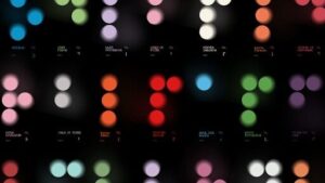
Some of the 70 shades from Coral that were used to create the Colours That Touch series of Cromopoems.
Working together with VML Brasil and the Dorina Nowill Foundation for the Blind, the Touching Colours project draws on neuroscience studies, which show that colours also manifest themselves in the brains of blind people through emotions, memories and sensations.
The project uses braille and sound to translate RGB, CMYK and HEX colour codes into so-called Cromopoems¬ģ, which reimagine a set of 70 colours into a unique sensory experience.¬†
For example, Citrus Orange is described as: ‚ÄúThat urge to bite into a fresh fruit in the playground. Letting the juice run down your chin and spending the day with its scent on your hands. That colour is Citrus Orange, a vibrant, warm shade of orange.‚ÄĚ
 Touching Colours was recently shortlisted in the Industry Craft category of this year’s Cannes Lions. 
‚ÄúWe‚Äôre giving blind and visually impaired people access to experiences that were previously restricted within the visual universe,‚ÄĚ says Alexandre Munck, Executive Superintendent of the Dorina Nowill Foundation for the Blind.¬†
‚ÄúBy transforming colour into sensation, poetry and sound, Coral is contributing to broadening horizons and reinforcing the importance of accessibility as an essential part of innovation.‚ÄĚ
Adds Daniel Geiger Campos, Global Director of AkzoNobel‚Äôs Decorative Paints business and member of the Executive Committee: ‚ÄúThis project has taken a crucial step on the path to inclusion to ensure that more people can feel and choose colours in an innovative way, going beyond sight to explore new forms of sensory connection.‚ÄĚ
The 70 colours¬†were selected from nine chromatic scales in AkzoNobel‚Äôs portfolio. From these, initials were created in braille, adding graphic value and establishing a unique creative path for the project’s visual language.
The next step was to assemble the Cromopoems into a colour fan that’s accessible to blind and low-vision people. It’s based on three essential elements: colour, braille and the sensitivity of the visually impaired person.
Printed on black cards, each colour in the fan is delivered through the emotions and sensations evoked by the braille text. Spoken audio versions of the Cromopoems are also available. 
Explains¬†Gabriel Sotero, Executive Creative Director at VML Brasil:¬†‚ÄúOur challenge was to create an experience that transcended vision, combining accessibility with the beauty of poetic expression.‚ÄĚ
The initiative was launched to coincide with Coral’s 70th anniversary in Brazil, hence the palette of 70 colours. 
To ensure the Cromopoems are also accessible to those who don’t have access to the braille colour fan, audio versions of the descriptions (in Portuguese) have also been made available via a dedicated YouTube playlist.


